Author: Johannes Laakmann
Date: 06.10.2020
While our ancestors hunted with bows and arrows, dogs were by their side as faithful companions. It is thought that the first domestication of dogs may have taken place 16,000 years ago.
In ancient Egypt, people were particularly fond of cats: killing a cat was punishable by death, they were mummified and, when their feline family members died, the entire household would mourn their pet.
Ever since, our love of animals has remained unbroken around the world. For example, every year, consumers spend billions on pet supplies; in Germany alone, this figure is just under 5 billion euros.
Which countries prefer cats, and which prefer dogs? Do pets improve your health? How big is the world’s largest dog? Our latest infographic explores a range of interesting and worthwhile facts on this very topic. Enjoy reading!
Information about current topics and trends as well as free infographics every month in our newsletter!
OUR VALUE ADDED
Individual information design – directly from the expert for data research
We at Statista Content & Information Design have been dealing with data, facts and analyses for years. Therefore we understand particularly well how these can be presented visually. Also, Statista’s portal comprises more than one million statistics, studies and reports from over 22,500 sources – the ideal basis for exciting, customized data storytelling.
Discover our products for your individual data visualization
Author: Sarah Tebbe
Date: 27.08.2020
The coronavirus is impacting all facets of our lives – and yes, this includes our sex lives too. Is it bringing us closer together? Are we having more sex? Or are our fears and concerns overshadowing our love lives? How have people’s sex lives changed around the world?
Believe it or not, the pandemic has even affected porn preferences, with videos containing the keyword “quarantine” having become particularly popular.
We have collected facts and figures surrounding the current global state of people’s sex lives and brought these to life in a bold and visually striking infographic. Designer Sandy Geist has chosen a colourful, lively style that reflects the way that sex should be.

Information about current topics and trends as well as free infographics every month in our newsletter!
OUR VALUE ADDED
Individual information design – directly from the expert for data research
We at Statista Content & Information Design have been dealing with data, facts and analyses for years. Therefore we understand particularly well how these can be presented visually. Also, Statista’s portal comprises more than one million statistics, studies and reports from over 22,500 sources – the ideal basis for exciting, customized data storytelling.
OUR PRODUCTS
Discover our products for your individual data visualization
Author: Friederike Hansmann
Date: 02.08.2020
Plastic is practical, versatile and long-lasting. The latter proving problematic when trying to dispose of it. Millions of tonnes of plastic have been produced since the 1950s, and sources suggest most of it has not been recycled. We are drowning in rubbish.
One possible solution to this problem is bioplastic. In this month’s striking black/white infographic by designer Jörg Huylebrouck, we examine the different types of available bioplastic. Namely, bio-based, biodegradable and compostable materials.
Critics of bioplastic point to the fact that the raw materials needed to produce alternatives to conventional plastic usually have to be cultivated. A process which in turn can also have an adverse effect on the environment. While bioplastic can be viewed as a positive attempt to reduce plastic waste, a universal cure for the problem has yet to be found.

Information about current topics and trends as well as free infographics every month in our newsletter!
OUR VALUE ADDED
Individual information design – directly from the expert for data research
We at Statista Content & Information Design have been dealing with data, facts and analyses for years. Therefore we understand particularly well how these can be presented visually. Also, Statista’s portal comprises more than one million statistics, studies and reports from over 22,500 sources – the ideal basis for exciting, customized data storytelling.
OUR PRODUCTS
Discover our products for your individual data visualizatio
Author: Sarah Tebbe
Date: 03.07.2020
The term ‘fake news’ refers to media pieces featuring sensationalized headlines alongside falsified images and claims. Typically used for propaganda purposes, the goal of these fake stories is to give the impression that they are real news sources. The term was selection as Collins Dictionary’s official Word of the Year in 2017 and has become a common day-to-day expression since.
Addressing the problem of fake news around the world, we produced six graphics that take a closer look at how the topic is perceived in different countries. The core statements from various surveys and studies are presented in a compact Instagram-friendly format.
The style of the infographics, created by our graphic designer Sandy Geist, is characterized above all by a well-suited color palette. She limits herself to a handful of colors that are rich in contrast, thereby drawing the viewer’s gaze purposefully through each image.
How to differentiate between quality media sources and fake news?
Germany’s Federal Agency for Civic Education recommends taking the following steps in order to help distinguish real news from fake news:
Information about current topics and trends as well as free infographics every month in our newsletter!
OUR VALUE ADDED
Individual information design – directly from the expert for data research
We at Statista Content & Information Design have been dealing with data, facts and analyses for years. Therefore we understand particularly well how these can be presented visually. Also, Statista’s portal comprises more than one million statistics, studies and reports from over 22,500 sources – the ideal basis for exciting, customized data storytelling.
OUR PRODUCTS
Discover our products for your individual data visualization
Author: Sonja Köhn
Date: 03.06.2020
It is impossible to ignore the ongoing impact the Covid-19 pandemic is having on our lives. This month our infographic shows how some aspects of daily life have changed as a result. The widespread closure of schools, for example, is thought to have affected up to 1.38 billion learners as of late March. Meanwhile, the sudden shift to remote working is one such change expected to have long-lasting effects. Following the pandemic, 68% of Germans have stated they would like to work remotely more often.
Our designer Raphael Hammer has created an isometric-style illustration, with each topic area allocated its own quarter of the infographic. Each topic is then afforded its own principle colour and corresponding design details. The almost monochrome effect of the illustrations allows them to perfectly complement the data presented. Especially effective, are the subtle movements which bring the entire graphic to life.
Information about current topics and trends as well as free infographics every month in our newsletter!
OUR VALUE ADDED
Individual information design – directly from the expert for data research
We at Statista Content & Information Design have been dealing with data, facts and analyses for years. Therefore we understand particularly well how these can be presented visually. Also, Statista’s portal comprises more than one million statistics, studies and reports from over 22,500 sources – the ideal basis for exciting, customized data storytelling.
OUR PRODUCTS
Discover our products for your
individual data visualization
Author: Johannes Laakmann
Date: 11.05.2020
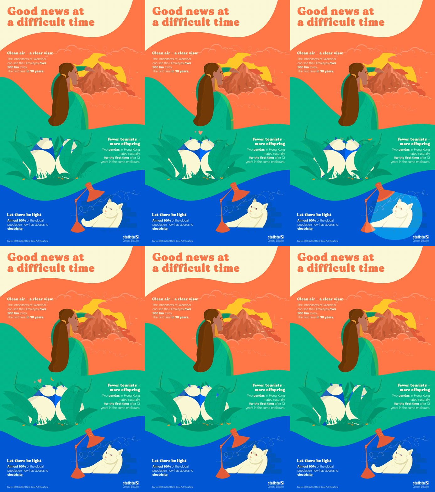
The Covid-19 epidemic is currently dominating the news, conversations and our everyday lives. With our graphic we wanted to spread a little optimism and present three facts that give us a bit of courage and help us feel more positive at this time.
Our designer Raphael Hammer has accordingly created an animated graphic that gives some insight into a better world. A colorful style highlights the core character of the infographic, which combines both static and animated elements, while revealing loving details even upon a second and third glance.

Information about current topics and trends as well as free infographics every month in our newsletter!
OUR VALUE ADDED
Individual information design – directly from the expert for data research
We at Statista Content & Information Design have been dealing with data, facts and analyses for years. Therefore we understand particularly well how these can be presented visually. Also, Statista’s portal comprises more than one million statistics, studies and reports from over 22,500 sources – the ideal basis for exciting, customized data storytelling.
OUR PRODUCTS
Discover our products for your individual data visualization
Author: Christopher Ledsham
Date: 03.04.2020
This latest infographic from the Statista Content & Information Design’s in-house team covers the topic of smart homes. With many people around the world currently spending more time inside their own homes, we took the opportunity to explore the wide range of smart devices that help us work, entertain ourselves or even monitor our energy consumption around the house.
The graphic incorporates survey data in order to present the perceived advantages provided by domestic smart appliances, while highlighting that an overwhelming majority of users (87%) are both happy with their devices and use them regularly. In order to provide meaningful comparison, the infographic presents market penetration in a range of countries and further breaks down spending on smart revenue by segment.
Visually, the graphic links statistics with their relevant topics with a mixture of clear symbols and classic chart formats. This is vibrantly brought to life with a harmonious mixture of flat illustrations, line icons and a warming color palette.

Information about current topics and trends as well as free infographics every month in our newsletter!
OUR VALUE ADDED
Individual information design – directly from the expert for data research
We at Statista Content & Information Design have been dealing with data, facts and analyses for years. Therefore we understand particularly well how these can be presented visually. Also, Statista’s portal comprises more than one million statistics, studies and reports from over 22,500 sources – the ideal basis for exciting, customized data storytelling.
OUR PRODUCTS
Discover our products for your
individual data visualization
Author: Friederike Hansmann
Date: 06.01.2020
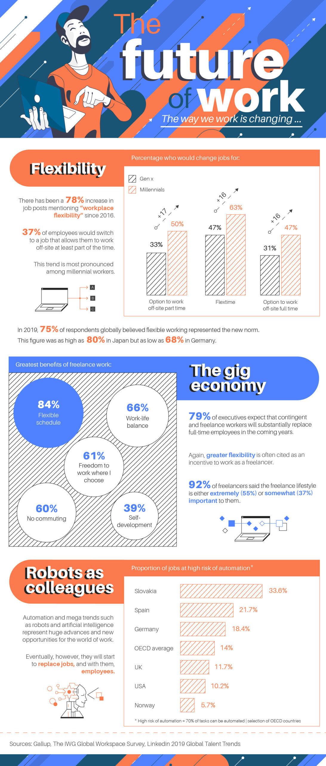
The first blog entry of 2020 is all about the way we work. As we hurtle into a new decade, it might feel like everything around us is changing and the world of work is no exception. Global trends such as robotics and artificial intelligence look set to turn the way we work on its head with 18% of jobs at eventual risk of automation in Germany.
In the more immediate future, the workforce is already undergoing transformation as ever-increasing numbers look for flexible working time, the option to work part time or to be self-employed. The recent Statista Trend Compass found that 79% of executives expected contingent and freelance workers to substantially replace full-time employees in the coming years.

Information about current topics and trends as well as free infographics every month in our newsletter!
OUR VALUE ADDED
Individual information design – directly from the expert for data research
We at Statista Content & Information Design have been dealing with data, facts and analyses for years. Therefore we understand particularly well how these can be presented visually. Also, Statista’s portal comprises more than one million statistics, studies and reports from over 22,500 sources – the ideal basis for exciting, customized data storytelling.
OUR PRODUCTS
Discover our products for your individual data visualization
You need to load content from reCAPTCHA to submit the form. Please note that doing so will share data with third-party providers.
More Information